Personalized Mouthguard: 3 Tips For The Best Mouthguard Graphics

Let’s talk about graphics.
At Gladiator, we’ve seen a lot of different designs and logos that athletes have come up with over the years. Some are great and really pop on a mouthguard, but others fall short.
While the benefits of a custom mouthguard go far beyond the ability to customize and personalize your mouthguard, there is nothing wrong with fully taking advantage of the creative opportunity to display your unique personality through your gear. And we’re here to help.
Here are our best tips and tricks to getting the most out of your personalized mouthguard:
1. Less Is More
This is rule number 1! Keep in mind your logo can only be a big as your teeth allow.
A single logo is likely to cover both front teeth, while wider logos typically stretch from canine to canine. This is roughly less than half an inch in height and 1.5 inches in width.
While this is plenty of space to be creative, it does pose problems for intricate and/or thin details, which may be lost in the tight space. You might have a cool logo that you really want to use, but a ton of detail in the graphic at that size likely won’t have the same appeal. The same goes for any small text within your logo, as most of the time text ends up illegible at that size.
There are still great looking logos for you to use, just try to use graphics with thicker details, and make sure they fit a horizontal layout, not a vertical one.
2. Color Coordination
Along with the layout and details of your graphics, color also matters. This applies to your logos, and also the actual mouthguard itself.
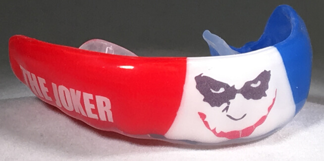
It’s important to understand that the base colors of your mouthguard are the most visible graphic element. Bi and tri-color options are great and look cool, but if you also have a multicolored logo, your graphic elements may clash in a negative and unappealing way.
Be aware of all the colors you are using. If your logo or text is plain in color or only uses a single color, mix it up with a bi or tri-color upgrade. If you have a very colorful logo and you want it to be the primary focus, a single color base mouthguard may be best.
3. Be Unique
There are a lot of great designs that are available, but being unique and representing your true personality makes your mouthguard the most fun.
Sure fangs are cool, but maybe you want blue fangs. Or metallic gold!
This is your space to go nuts. Maybe you have a short and meaningful expression or mantra. Maybe you want to tell your opponent they need to “Back Off” when you flash your mouthguard, or any number of fun phrases. Don’t be afraid to reach out and ask us how to best make your vision come to life.
Most importantly … have fun with your Gladiator!


